Turn your JPG images into an animated and interactive Format. Just upload your JPG images and chose from more than 30 transition effects like 3D Cube, Coverflow and Blinds.
Creating an Image FX Creative only takes a few minutes.
All you need are some JPG images.
2022.12
Spec sheet - Image FX
Required assets
3D Cube map or spherical map
You can upload any number of JPG images for the 3D cube.
Image1.JPG
Image2.JPG
Image3.JPG
Optional images
You can add any PNG or JPG image for the CTA, logo and other overlay images or an MP4 video to be displayed on the 3D cube.
Logo.PNG
CTA.PNG
Supported Formats
Mobile formats 300x250 - Medium rectangle 320x50 - Mobile leaderboard 320x320 - Mobile square 320x480 - Interstitial
Desktop formats 120x600, 160x600 - Skyscraper 300x250 - Medium rectangle 300x600 - Half-page 728x90 - Leaderboard 800x250, 970x250 - Billboard
Custom formats You can create any size as a custom format.
Responsive
The 3D cube supports Responsive behaviour. Both automatic and customized Responsiveness is available.
Supported URLs and Tracking
Clickout URLs
General * Main * CTA
Optional * Separate URL per item
Integrated tracking
General * CTR * Visibility * Dwell time * Engagement
Special * Swipe * Images shown
2022.12
Upload assets
Upload images for the Image FX
For the transition effect you will need an image without an alpha channel, so any JPG image is great. (PNG images will also work, just make sure that they don't not use an alpha channel.)
All transition effects are shown in "full-screen". So make sure that all uploaded images have the same aspect-ratio as the Creative. Otherwise the image will appear stretched. Drag and drop a JPG image onto one of the thumbnails to upload it.
Number of images
Use the slider to change the number of images used for the Image FX. Note: This will change the number of images for all Elements.
Image
x
x
CTA
x
x
Video
x
x
Text
x
x
2022.12
Elements
Add Element
Click "+ Add Element" to create additional layers to the Creative. Element A/B/C will create a layer which is linked to the Image FX and drawn on top of it. So for each Element you can upload different images which will switch together with the main Image.
Disclaimer
The "Disclaimer" creates a static image, which is not linked to the Image FX switch.
Edit Element
Select an Element to see the Element properties. Upload PNG or JPG images via drag and drop or click on a thumbnail to open a file-browser. Use the sliders to move and scale the Element.
Remove Element
The removed element will be hidden. But you can turn it back on again at any time. No layout information will be lost.
Image
x
x
CTA
x
x
Video
x
x
Text
x
x
2022.12
Settings
Border
If your Creative has a completely white or black background, the IAB standards require to draw a border with a contrasting color around the canvas of the Creative. Enable the "Show Border" feature by checking the button.
Chose the color using the color-picker.
Background
Use the color-picker to chose a background color. Note: Some Image FX animations always fill the whole screen so the background color is never visible.
Color picker
Swipe gesture
Upload image
Upload your own PNG image for the Gesture by using drag and drop or click on the thumbnail to upload an image.
Edit
Use the sliders to change the size and position of the Swipe gesture.
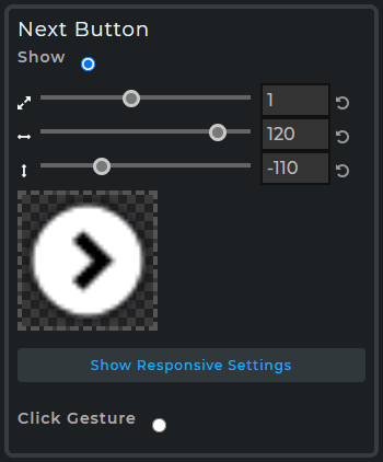
Next button
Show Next button
Enable this to display a clickable "Next" button. This way the user can control the Image FX clicking the button instead of a swipe gesture. Note: The swipe gesture will still work event when the button is enabled.
You can adjust the size and position of the button by using the slider. To upload your own button image just drop a PNG image over the drop area.
Responsive
Enable
Check the box to enable Responsive behaviour. This will turn on the automatic Responsive behaviour and enable additional Responsive features in the respective Elements.
Aspect
Turn "Aspect Limits" on to define the minimum and maximum Aspect ratio allowed for the responsive feature. Aspect ratios below and above the defined range will create borders to fill the target area.
Scale
Defines the scaling behaviour of an individual Element.
Fixed - Does not scale at all. Scale up - Scales up to the larger width or height. Cropping may occur. Scale down - Scales down to the smaller width or height. No cropping will occur. Scale Width/Height - Scale so that the size relative to the width/height stays the same.
Position
Defines the repositioning behaviour of an individual Element.
Pin - Move at a fixed distance to the anker point. Relative - Move with a relative distance to the anker point.
Aligning
By default the aligning is turned to "automatic". In this mode the aligning behaviour is automatically set, depending on the position of the Element on the canvas.
Turn on "Align custom" to enable customized aligning behaviour and chose between "Left/Center/Right" and "Top/Center/Bottom" aligning for the selected Element.
Weight optimization
Set the maximum Quality of all JPG images. By default the Quality is set to "90%".
To reduce the weight of your banner, just chose a lower quality setting and all images will be re-encoded to fit the new setting. You can see the resulting size in kb in the header under "Estimated weight:".
Note: All uploaded JPG images which have a lower quality will not change at all, so your banner will never become larger than the original assets. Only Images with a higher quality will be re-encoded to match the defined quality.
Image
x
x
CTA
x
x
Video
x
x
Text
x
x
2022.12
Tracking & URLs
Click URL
You can set the Clickout URL directly here by adding the URL into the "Main/Default" field. Or you can overwrite the URL in the Tags.
Tracking
Impression
Once the Creative is loaded, this TAG is fired.
Measurable
Once the Creative is loaded and Primo can detect viewability this TAG is fired. The number of measurables is maximum the number of impressions.
Viewable
Once the Creative is loaded and viewability is detectable Primo fires this TAG when at least 50% of the Creative was visible for at least 1s.
Touch Down
Is triggered as soon as the mouse is down (Left click) anywhere over the Creative.
Mouse Enter
Is triggered as soon as the mouse is over the Creative.
Swipe
Tracks all swipe event left/right.
Image
x
x
CTA
x
x
Video
x
x
Text
x
x
2022.12
Preview
Live view
The Preview shows your interactive Creative exactly as it will be shown when it is live. All changes will be shown immediately in realtime.
Timeline controls
Play/Pause toggles between Play and Pause mode. Reset sets the time to 0 and restarts all animation from the beginning Timeline - Use the slider to set the current time Current time - Type in the current time directly Repeat - Turn Repeat on to make the animation restart when the end of the animation has been reached.
Zoom
By default the Zoom is set to 100%. Setting it to 50% or 75% makes the Preview smaller, so that even large Creatives can fit to very small screens. Setting it to 150% or 200% shows the Preview larger, so that you can check for details or simulate higher resolutions.
Responsive sizes
Click on one of the icons to set your preview to the most common formats on mobile devices. Or hold the lower left edge of the Creative preview and move it to any custom size.
Event output
The Event output shows all events that are triggered in realtime. By default all common events are automatically integrated, including CTR, viewtime, engagement and more.


