With the Primo Hotspots format you can add Hotspots to your Creative. A click on a Hotspot will open a PopUp image to highlight special features or show information like product details, annotations or close-ups .
Creating a Hotspot Creative only takes a few minutes.
All you need are some PNG and JPG images.
2022.12
Spec sheet - Hotspots
Required assets
PopUp images
You can upload any PNG or JPG image for the PopUps.
Optional images
You can upload any PNG or JPG image for background, CTA and logo.
Background.JPG
Logo.PNG
CTA.PNG
Supported Formats
Mobile formats 300x250 - Medium rectangle 320x50 - Mobile leaderboard 320x320 - Mobile square 320x480 - Interstitial
Desktop formats 120x600, 160x600 - Skyscraper 300x250 - Medium rectangle 300x600 - Half-page 728x90 - Leaderboard 800x250, 970x250 - Billboard
Custom formats You can create any size as a custom format.
Responsive
The Hotspots format support Responsive behaviour. Both automatic and customized Responsiveness is available.
Supported URLs and Tracking
Clickout URLs
General * Main * CTA
Optional * Separate URL per item
Integrated tracking
General * CTR * Visibility * Dwell time * Engagement
Special * Hotspot - Mouse-over * Hotspot - Opened
2022.12
Upload and edit images
Upload Hotspot image
You can upload any PNG or JPG image as a Hotspot PopUp.
Upload image via Drag-and-drop
To upload your own images for the Hotspot PopUps, just drag and drop an image over a hotspot thumbnail.
Upload image via File-browser
Or click on a Hotspot element and upload the image from there.
In the Hotspot properties click on the thumbnail to open a file-browser and chose the image.
Edit Hotspot
Select Hotspot
Select a Hotspot to open the Hotspot properties.
Edit Hotspot
Use the sliders to scale and move the Hotspot. Change the Hotspot color using the Color picker and the Opacity slider. You can see the result directly in the Live view.
Edit the PopUp image
Open the PopUp in the Live Preview so that you can see your live changes.
Use the sliders to scale and move the PopUp image.
2022.12
Hotspots Settings
Select the "Hotspots" tab to show the Hotspots settings.
Upload custom Hotspot images
Just drop your PNG image over the thumbnails for the "Unselected" and "Selected" Hotspot to upload it. You can see the result immediately in the Live view. Note: To adjust the size, select a Hotspot in the "Layers" tab and change the size from there.
Tint background
When you select a Hotspot in the Live view, the Background gets darker to give a visual focus to the PopUp. You can adjust the color of the tint effect by using the Color picker in "Tint background".
2022.12
Click gesture
Enabled
Remove the checkmark to disable the Click gesture.
Upload Click gesture image
Drag-and-drop a PNG image over the thumbnail to upload or click on the thumbnail to open a file-browser.
Edit Color
Click on the color to open the Color picker. Use the Opacity slider to change the transparency of the Click gesture.
Scale, rotate and move
Use the sliders to scale, rotate or move the Click gesture image.
Animation
Use the sliders to change the Click gesture animation.
Start delay defines the time until the Click gesture appears after the start of the banner. Duration defines the speed at which the animation is played. Wait 2nd click defines the time between the click to open and close the Hotspot. Interval defines the time between the end of one Click gesture animation and the start of the next one.
Chose a Hotspot for the Click gesture
The Click gesture will always appear on the first Hotspot from the left in the layers. To change the order hold the Left Mouse Button on a Hotspot and drag it left/right.
2022.12
Animation
Enable animation
Select animation
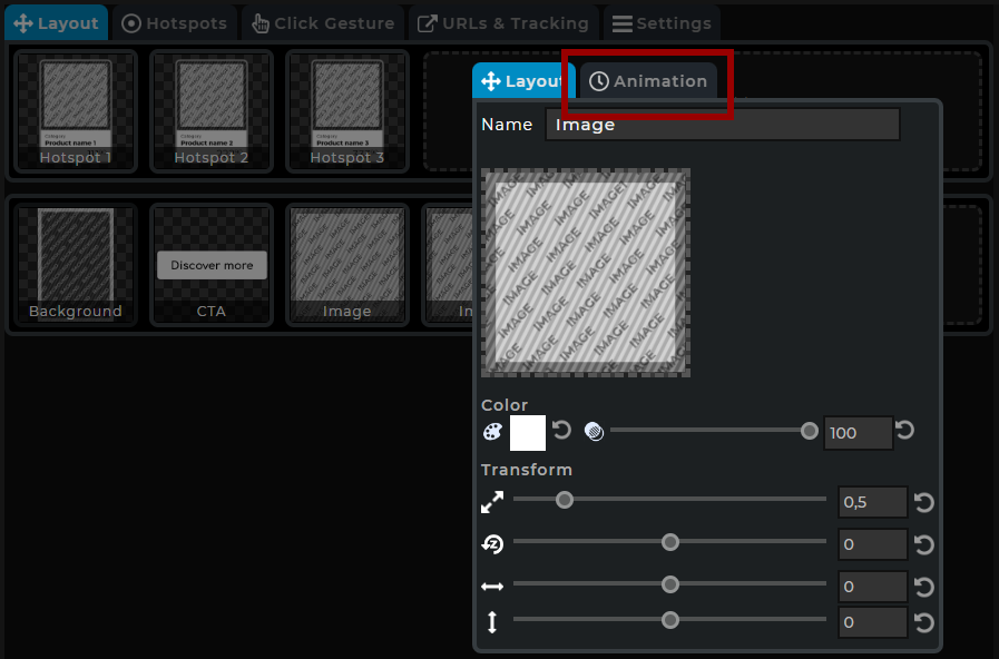
Select the Element you want to create an animation for. In the Popup select the Tab "Animation".
Enable animation
Enable the Animation for Intro, Outro, Repeat and Hover by checking the button.
Edit animation
Show animation properties
Click on the header of an animation to open the properties.
Enable animation types
Use the icons on the right of the header to enable/disable what you want to animate: Scale, Rotate, Move, Color and Opacity. In the screenshot "Color" now has been enabled:
Intro/Outro
The Intro animation plays an animation at the beginning of the Creative. It is often used for a fade-in effect of the Element. Optionally an Outro animation can be added to use as a fade-out for the Element. This way also Transition animations from one scene to another can be created.
Outro - Reverse
By default the Outro animation is set to "Reverse". This way the Outro is the same as the Intro, only played in reverse.
Turn "Reverse" off to enable an Outro animation separate to the Intro.
Wait
The "Wait" defines the time from the end of the Intro to the start of the Outro animation.
Out duration
Defines the duration of the outro animation.
Repeat
The Repeat animation plays an animation repeatedly at a certain interval. Usualy to draw attention to the Element.
Delay
Delay defines the time from the start of the Creative until the Repeat animation is played for the first time.
Interval
The Interval time defines the time between the end of one Repeat animation and the start of the next one.
Duration
Defines the duration of the animation.
Pulse
Repeat animation often use a "pulsating" effect where a change in size or color appears two times after another. The "Pulse" defines how often the animation is played on each repeat.
Hover
The "Hover" Animation defines the behaviour when the mouse is over the Element.
Duration
Defines the duration of the animation.
Image
x
x
CTA
x
x
Video
x
x
Text
x
x
2022.12
Free layout
Add custom Elements
Add an Element
Click on the "+ Click to add..." area and chose what kind of Element you want to add. Then select the Element to upload images and edit the properties in the Overlay. To add an Image just drop your JPG or PNG image over the "+ Click to add..." area.


